


 Title Index
 Recently Changed
 Page Hierarchy
 Incomplete
 Tags
Tags


Formcomposer contains a special set of commands for generating form field labels and inputs. Using custom markup can be a good alternative strategy if the default form view does not provide the necessary stylings or layout you desire.
Using formcomposer markup to generate forms instead of generating your own HTML can be helpful in a couple of ways.
- Any changes to label information or display type for a field automatically get updated.
- Automatic id/class generation (automatically work with the default client-side validation code).
- If you remove a field it will not longer be rendered in the custom output
Currently, the basic usage for referencing fields is based on the given parameter name of a field.
Field parameter name: firstname
Formcomposer markup for field label: {{ form.firstname.label }}
Formcomposer markup for field input: {{ form.firstname.input }}
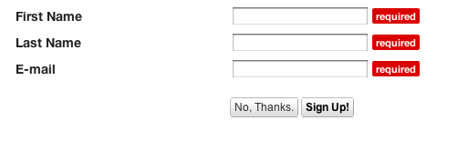
Here's an example for a simple email newsletter signup.
Fields: First Name, Last Name, Email.
Using the default markup {{ form_for_page }} we get the following:
Given that the page in use with this form is HTML we could essentially update the CSS for this and get a lot of bang for the buck but if we need to use a different layout it gets more problematic.
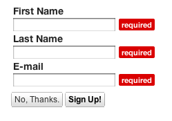
If we want to use a vertical layout because our past studies have shown the performance on those are better then we can use Formcomposer markup to generate that for us. Consider the following
<form>
<table>
<tr><td>{{ form.firstname.label }}</td></tr>
<tr><td>{{ form.firstname.input }} </td></tr>
<tr><td>{{ form.lastname.label }} </td></tr>
<tr><td>{{ form.lastname.input }}</td></tr>
<tr><td>{{ form.email.label }}</td></tr>
<tr><td>{{ form.email.input }} </td></tr>
</table>
</form>
With a little work we can generate a whole new layout.
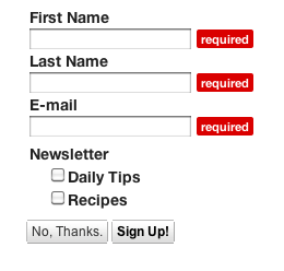
If you have a field that contains options, like a checkbox group we simply extend the metaphor a bit further.
If we add the following to the bottom of the form we'll add a checkbox group so that we can choose which newsletters we want
<tr>
<td>
{{ form.newsletter.daily_tips.input }} {{ form.newsletter.daily_tips.label }} <br />
{{ form.newsletter.recipes.input }} {{ form.newsletter.recipes.label }} </div>
</td>
</tr>
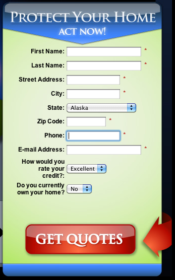
The possibilities are nearly endless using the above markup and if we remember that ultimately it is all just plain ol' HTML, CSS and Javascript. Here's real world example from a customer who generated their own design and updated the form elements to utilize formcomposer custom form markup.
These are just the first steps towards realizing a markup that will help the developer workflow when creating custom forms. We hope that the basic functionality listed above will at least help you get started in this process.